Je suis venu sur les rivages

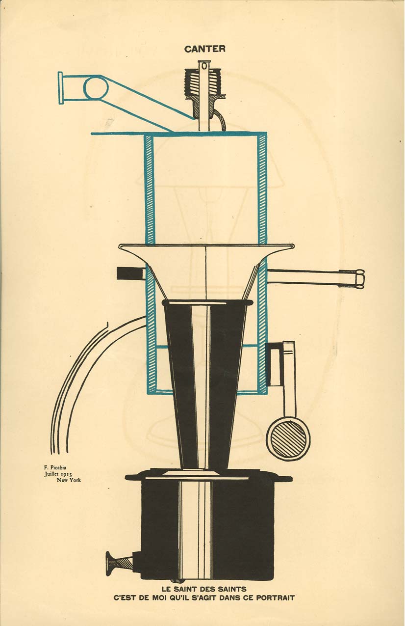
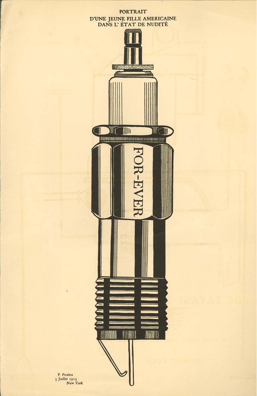
The image I chose to examine for this post was created in 1915 for Alfred Stieglitz's Dada magazine, 291, by a French artist named Francis Picabia. Picabia was associated with Cubism, Abstract art, Surrealism and Dada, which lends a unique look to his artwork. Picabia was also a member of a group of artists who were retroactively labeled, 'New York Dada'. The New York Dada group arose almost independently of the movement in Europe and their works grew up around Alfred Stieglitz's art gallery which was named 291. The Dada movement arose as an artistic revolt against war, sexism and racism, however, the New York Dada movement seems to have a more oblique purpose. The New York artists were not associated with the anti-war works of their European counterparts, however, many of them were from Europe and had moved to New York to escape the war. With that in consideration, much of their art could almost be considered protest art, but not in the same sense as the European Dadaists.

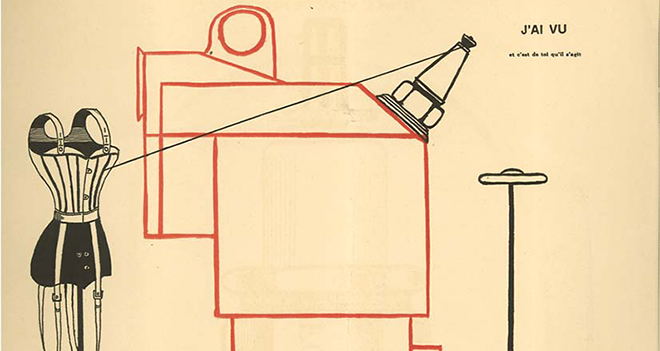
All that said, this issue of 291 was primarily constructed by Picabia as a visual salute to the creators of the magazine. The image above was called De Zayas! De Zayas! and was a metaphorical picture of Marius de Zayas, one of the primary creators of 291, re-imagined as some kind of mechanical being. However, the text in the image reads "je suis venu sur les rivages, du pont - euxin" which roughly translates to "I came on shore, Bridge - Black Sea". This line is very confusing in context with the image and it's history. However, when you look at the image in context with the images that proceeded it, this image combined all the other mechanisms of the previous images into one cohesive whole. This leads me to believe that Picabia saw de Zayas as the force which held their band of artists together and this image is paying homage to that.

Frankly, I don't know what else to make of this image and I cannot make much of the statement in French. I do have to say that the Dadaists are far more confusing than the Vorticists -- unlike the vorticism movement, Dada artists composed no manifesto, they did not seek to convert others to their ways. And while their art was in essence a protest to the reactions to WWI that other artistic movements were having, I do not think that Dada art was solely an anti-war movement. Francis Picabia said this:

"Dada smells of nothing, nothing, nothing.
It is like your hopes: nothing.
Like your paradise: nothing.
Like your idols: nothing.
Like your politicians: nothing.
Like your heroes: nothing.
Like your artists: nothing.
Like your religions: nothing".

Personally, I think that the Dada movement -- in New York at least -- was a return to art for arts sake. That is not to say there was no subtext, or overarching goal by the movement, but instead of merely becoming bogged down in the issues of the time, Dadaists seem to enjoy the humor and sarcasm in their work. In a piece written in 1920 by Marsden Hartley, he described the Dada movement thusly:  

 We must all learn what art really is, learn to relieve it from the surrounding stupidities and from the passionate and useless admiration of the horde of false idolaters, as well as the money changers in the temple of success. Dada-ism offers the first joyous dogma I have encountered which has been, invented for the release and true freedom of art.

By subscribing to the doctrine that nothing was greater than anything else and tackling their issues with humor, I think the Dadaists and Francis Picabia were able to -- at least for a little while -- return to the pre-war joy of being an artist.

Apollinaire on literary movements

There is an obvious difference in the Apollinaire pieces when it comes to their visual representation of their texts.  The piece "It's Raining" features its words dripping down the page in an obvious representation of the continued metaphor of rain throughout the piece.  "Voices" and "marvelous encounters of my life" are raining down, slipping through their holder's hands as droplets of rain.  The voices bemoan the great number of deaths caused by the war, yet more than that, they lament the totality of the insignificance in these deaths...the pointless murder of those "dead even in memory".  They can no longer remember the happy moments of life, the sunshine cannot reach through the rain. In relating these deaths and the war to rain, an eternal element of nature, the poem itself is becoming part of the "ancient music" which the war has caused.  The "ancient music" is the cycle of human life, the seeming necessity of war as a cleanser of humanity, just as rain is a natural and cyclic cleanser of the earth.


In Apollinaire's second piece, there seems to be little, if any, relevance of the form of the poem to its content.  "Thunder's Palace" has regular strophes as any poem of any era.  However, considering the poem's discussion of the warring sentiments of old vs. new, perhaps the traditional form of the poem is itself Apollinaire's comment on the Avant-Garde movement.  The piece reminded me of the Leon Trotsky quote from the Perloff reading for tomorrow:

"Futurism...has meaning only insofar as the Futurists are busy cutting the cord which binds them to the priests of bourgeois literary tradition.  But the meaninglessness of this call becomes evident as soon as it is addressed to the proletariat.  The working class does not have to, and cannot know the old literature, it still has to commune with it, it still has to master Pushkin, to absorb him, and so overcome him" (153).  

Apollinaire's writing in "Thunder's Palace" seems to reinforce this notion of needing to accept the past (rather than obliterate it) in order to achieve new heights in the future.  His piece is full of images of shapes, lines, bold colors, and machinery/technology , drawing on the traditions of the emerging modernists, while at the same time the form of the work fits much older standards and could be seen as a possible betrayal of the modernist movement.  Here, the content of Apollinaire's poem is key, particularly with the clarity he reaches at the work's close:

"And still everything seems old in this new house / So you can understand men had a love for antiquity / Even when they lived in caves / Everything there was so precious and new / Everything here is so precious and new / That something older or something already used seems / More precious still / Than what is at hand ...

You can see that what's simplest and newest is / nearest to what's called antique beauty / And what's overladen with ornaments / needs to age before it can acquire the beauty labeled antique."

Apollinaire is comparing the clashing literary movements and their outrage towards one another, simplifying them by placing them in the greater context of the universe of Time.  Just as the Futurists, Vorticists and other Avant-Gardists and Modernists rebel against their ancestors, so will future generations rebel against the poets of the early 20th century.  The only way to achieve a poetry of maturity is to accept this fact of art and life, drawing on the work of predecessors to help pave the path to "beauty".

Holy of Holies

This image by Francis Picabia is entitled “Le Saint des Saints, c’est de moi qu’il s’agit dans ce portrait,” which translates to mean “The holy of the holies is to me that it is in this picture,” which, of course, sounds crazy to any normal person looking at this image. When I first looked at Picabia’s images, my initial reaction was: “What?!” I had to do a little research on him before I even felt comfortable attempting this blog entry.

 Once I learned a little about Picabia and his portraits mécaniques, I felt a little less confused. Apparently, Picabia used these strange mechanical images to inspire people to question his art. The questioning of whether or not these images were art, essentially, made them art. He mixed mechanical images with other mechanical images and connected them to the human experience through his titles.

This particular image appears to be, maybe, a steam engine of some kind, mixed with something that resembles a camera or a horn. Even just looking at the image, I struggle to classify it. However, what makes this image even odder is the title. How is this steam engine / camera / horn hybrid “holy” and what makes it the “holy of holies”? My first instinct, and one that ties in with the war, would be the reverence people had for machinery – for human creations intended to make life “easier” or “better.” Strangely, during the war, people were even seen as “machinery” in a sense. They worked together as one to “further” the human condition. So, Picabia was probably being ironic and sarcastic when he called this mechanism “holy,” but he clearly reflected prevailing views of his time.

The Relation Between Words and Images

In this image from the Dada magazine 291 edited by Alfred Stieglitz, the title is given as "Portrait of a Young American Girl in the State of Nudity". However, anyone who had glanced at the image itself would never have given it that title as a result of the contents of the image itself. There is no girl, no nudity, and no person at all. There is a complete divorce from the content of the image and its title. I think this is an artistic statement on the part of the Dadaists, saying that there is no inherent, necessary connection between a piece of art an what it is called. Furthermore, the piece blurs the lines of what ought to be considered art, since if this is considered from a rational point of view, the artist is lying when he writes "Portrait of a Young American Girl..." at the top of the page. However, this lie, or discrepancy at the least, ought to have no effect on the artistic merit of the piece as a whole.

In this way, the text at the top of the page is grouped in along with the image to be considered as part of a unified whole. The artist may be making a statemen about modernity and the efficacy of labelling ideas. I think of the Victorian ideals, Decorum, Progress, Nobility, etc., and how they were twisted by propagandists in the service of the war effort. If people can use these ideas in whichever way they want, the artist seems to be saying, then we might as well affix any label at all to an idea. Furthermore, if this is true, then there never was a real, essential definition of Decorum or Progress as ideas in the first place. The link between a piece of art and its title, similarly, is ultimately arbitrary. The image is just as much a picture of a young American girl as it is a picture of a trash can or a shopping mall. With no meaningful or inherent relationship between words and what they describe or signify, art becomes as juxtapositional as you want. The Dadaists expanded on this idea after the War brought on these questions about art.

Blast Magazine

I was highly impressed and amused by Blast magazine. Though I found it to be oppresively masculine and possibly slightly mysoginistic, it's been a long time since I've been assigned something so amusing. I was particularly entertained by the 'blast' and 'bless' pages, specifically by the blessing of the pope. I thought this was a little bit odd considering the number of authoritarian institutions that had been blasted on the previous page, but then thought maybe it was a little bit satirical. The violent, sparsely punctuated text got me caught up in an aggressive, quick read that felt like reading an angry, nonsensical Shel Silverstein poem aloud.

I suppose, more than anything, I was completely and utterly bewildered that a magazine like this existed at the time. I've always thought of the early 1900's as immensely conservative, particularly in media, and was pretty surprised to see this and read the content. It was inflamatory, intelligent, angry, and really funny. I didn't take any of the text personally because I'm so removed from the time period and most of the issues they confronted, so it was easy to read as a possible satire - a little bit like The Onion. I would be interested to know how much of it was satire and how much of it was honest anger or sensationalism.

Kristyn Baker BLAST

     The word choice in the beginning is so distictly violent as to not be ignored.  As a reader, we come across words like "curse", "sins" "infections", "dismal", "vampire", and "serpentine".  Clearly, these words are not to be mistaken for having positive conotations.  As an English major, I found this blunt, straightforward style to be striking because often I come across class readings that are metphorical, ironic, or layred in deep meaning.  This was almost refreshing to read because of the way in the intention was not at all misleading and really leaves litte to no room for interpretation.  I was unable to find a visual pattern to the way Blast was laid out.  Certain words or sections are bolded and large while others are small and in indented paragraphs.  I tried to look through for some reasoning behind the visual aspect but was unable to come up with anything.  Does anyone have any ideas on this?  

     While I cannot know this for certain, I think part of why the rhetoric is so violently constructed is to create a stark contrast bewteen the 'blast' section and the 'bless' section.  If there was not a very distinct line between the diction in one and the diction in the other, this effect of contrast could have been lost.  The writers have a clear idea of what they want to say and where they stand on issues and because of this there is little to know ambiguity in the the sections.  We go from seeing words like "pig", "bad", "complacent", and "fussiness" to seeing the word "bless" again and again with long lists of positively connotative images.  One part of this juxtaposition that stood out the most to me was the mention of humor in both the 'blast' and the 'bless' section.  The first time hour is mentioned, the publication says "Blast Humour quack english drug for stupidity and sleepiness.  Arch enemy of REAL".  Humor is portrayed as a negative thing, something to be looked down upon almost as a lesser thing.  Then, in the 'bless' section is it brought up again: "Bless English Humour it is the great barbarous weapon of the genius among races".  Once humor is an amusement of the Englishman, it is a wonderful, powerful, intelligent thing.  This contrast seems to make an agenda clear and makes for an interesting comparison.


BLAST

For starters I find that the title of the journal itself is perfect for the content. BLAST says it all in one word. The material within the journal is in your face and grabbing for your attention. The words just pop out at you asking to read them. I think that this journal is very enticing and interesting to read. The way it goes about delivering its information and messages to the reader is unlike many other journals people read at this time. BLAST gives the reader different emotions on every page. There is humor and anger among other things. In many ways this journal can almost appear chaotic. I find that the pictures or rather the art in these pages can tie along with that. I have always found abstracts to be somewhat chaotic. The piece has to be studied in order to really figure out what it is saying or trying to say, in that way I find them chaotic. There are many things that interest me in this journal and as I have read it before and now read it again I am not sure that I can ever get enough of it or fully understand every page, but if nothing else it grabs and holds on tightly to the reader's attention. One of my favorite pages in the journal is 32-33. I find them to be quite interesting and entertaining the way it promotes itself, talking about the disagreeable way America looks at the UK and then agreeing with their opinions.

Blast

In BLAST magazine, what really struck me, was the BLAST and BLESSINGS part of the magazine. It is written in an extremely experimental style, that allows the authors freedom to do what ever they please. This section made me laugh, especially the part in BLAST England, where they curse the sky for only giving them rain and not snow. Blasting something was a very grave offense and I find it quite funny that everything that they BLAST, they go back and BLESS. It is this kind of turnabout that makes BLAST so unique.

When reading the MANIFESTO of BLAST, one finds out that the authors of BLAST wanted to be as controversial as possible. They took up one position and then on the next page took the other. This switching of positions caused much confusion and shocked the public. The creators of BLAST wanted to shock the people out of there complacency and in the publication of the first volume did so. BLAST was intended to confuse, not only with its unique style but its use of language, and I think it does so. 

BLAST

I had to re-read many parts of the magazine, as I am completely confused on what the object of outburst is in this magazine. One moment BLAST is blasting all these countries, people, and activities; the next it is Blessing. It’s like being in the mind of a bipolar individual who is fighting the Devil and the Angel inside.

I originally thought that this rant was the view point of artist extremist, but now I just feel completely lost on what the underlying message is.  There are so many paradoxes, which seem to be about multiple topics of aggravation which all seem to be related to a specific group of minority; mainly the artsy type.

I am deeply impressed with the setup and style of the magazine. Each page has a pattern which draws the eyes more deeply in the passage of interest. When reading this magazine I had a strong sense of the ‘Wonderland’ effect from Lewis Carol’s books. Where everything seems to be simply mad, and nothing makes for very much sense.

"Blasts and Blesses" and the Poster Aesthetic

In his introduction to BLAST, Mark Morrison cites Hugh Kenner's description of the magazine's "posterish conventions" as evidence of BLAST's intergration of consumer culture into its rhetoric.The "Blasts and Blesses" section of BLAST consciously evokes this aesthetic of advertisments, contrasting the content of a piece with its presentation. The attention-grabbing, variable format of BLAST's initial pages evokes the appearance of a propaganda poster: large, block letters, spartan sentences, and inflammatory diction. The eye-catching presentation of BLAST's front matter convinces the reader that this section of the magazine is of dire importance; yet the actual content of these first pages is not all it's trumphed up to be. Contradictory, bombastic, and often incoherent, the "Blasts and Blesses" hardly present a unified message in the same way that the Manifestoes do. Instead, they wallow in emotionality and hyperbole, taking a great deal of space to say very little. I read this section as a commentary on the pervasiveness of advertising and propaganda in society: BLAST wants to point out to its readers how the content of the day's polemical rhetoric has degenerated, even as the presentation techniques have increased. As a rhetorical statement of principle, the "Blasts and Blesses" say very little; but as a satirical adoption of advertising culture, this section is an interesting artifact.

Pages